Colour: setting the tone
Jo Bailey
January 2014
Section summary
- Choosing colour is subjective.
- Be aware of cultural interpretation of colour – the stop/go traffic light colours are near-universally understood.
- Make sure colour does not compromise legibility, or confuse graphs.
- For LAWA the colour choice was inspired by New Zealand’s palette, and interpretations of it.
- There was a deliberate strategy of walking a line between ‘pure’ (Modern) and ‘hybrid’ (Postmodern) colours.
- As with other elements of visual style, appropriateness is key.
To paint well is simply this: to put the right color in the right place
Paul Klee quoted in Tufte (1990, p.81)
Colour is one of the visual criteria that users rely on to assess credibility. However, it is hugely subjective. Read any web posts by supposed colour experts, and you will be bombarded by contradictory information on what different colours ‘mean’, as if this perceived 'meaning' is a static universal truth, transcending cultures.
One man’s serene is another man’s raving lunacy
Kress & Leeuwen (2002) highlight some scholarly examples of the range of attributes assigned to colours:
Goethe (1970) called yellow ‘serene, gay and softly exciting’ … Kandinsky (1977) said ‘it has a disturbing influence and reveals an insistent, aggressive character … it may be paralleled, in human nature … with violent, raving lunacy’ … Wierzbicka (1996), a cognitive linguist, called yellow ‘warm and sunny’ … Stefanescu-Goanga (1912), an early 20th-century colour psychologist said that blue was ‘calming, depressing, peaceful, quiet, serious, nostalgic’ … whereas for Franz Marc it was ‘the male principle, sharp and spiritual’, and for Novalis ‘female’, ‘especially attractive, and rare in nature’. Green has been seen as an ‘irritant’, and as ‘sulphurous’ (Goethe, 1970) as well as ‘calm and placid’ (Kandinsky, 1977).
Clearly, there is no magic formula in this area.
Purity and hybridity
Within the gamut of each colour there is also a huge diversity of hues, tints, tones and shades. Kress & Leeuwen (2002, p.357) discuss colour on a spectrum from “maximum purity” to “maximum hybridity”. This spectrum runs from the pure ‘Mondrian palette’ so closely associated with Modernism, to a “colour scheme of pale, anaemic cyans and mauves … a key signifier of the ideologies of postmodernism” in which the “idea of hybridity is positively valued”.
Learned meanings
How we interpret colours has a cultural dimension. Some colours have different meanings in different regions, for instance “in China and other parts of East Asia white is the colour of mourning; in most of Europe it is the colour of purity, worn by the bride at her wedding” (Kress & Leeuwen, 2002 p.343).
However, the green equals good, red equals bad convention is useful visual shorthand that has global currency thanks to the Vienna Convention on Road Signs and Signals 1968 . It is possible, therefore, to use these “status colors without concern for culturally dependent interpretations” (Microsoft, n.d.).
Web colours
“Color matters in user’s judgment about the Web site’s trustworthiness”
Alberts & van der Geest (2011)
In terms of website palettes, there is some research to suggest that, psychologically, ‘warm’ colours (e.g. red) can lead to “elated mood states, activity, vitality, anxiety” (Lee & Rao, 2010, p.111), whereas ‘cool’ colours have the opposite effect, although most research relates to e-commerce purchasing decisions.
A study by Alberts & van der Geest (2011) demonstrated blue and green colour schemes to have the highest perceived trustworthiness, but also underlined the fact that colour is highly contextual: “perception and evaluation of colors are linked to contexts and that judgment about the most appropriate or the most preferred color differs between contexts. People do not have just one favorite color, but a favorite color for each context”.
In terms of visualising data, “avoiding catastrophe becomes the first principle in bringing color to information: Above all, do no harm” (Tufte, 1990, p.90). As with web typography, aiming for ‘appropriateness’ is the safest route to credibility.
LAWA’s palette
“What palette of colors should we choose to represent and illuminate information? … Nature’s colors are familiar and coherent, possessing a widely accepted harmony to the human eye - and their source has a certain definite authority.”
(Tufte, 1990, p.90)
Within LAWA, colour needed to work appropriately for identity and navigation, and as part of a hierarchy within data visualisations and dashboards. The research phase had identified that ‘water brands’ (including LAWNZ), form a brandscape uniformly composed of strong blue and green hues. To break away from that was philosophically important (though the clients were not immediately seized of the need to make a distinction).
The lie truth of the land
LAWA’s focus on the environment became the starting point for choosing a palette. The palette formulated speaks of a visual terroir of the New Zealand environment.
Inspiration came directly from the elements, and also from interpretations of New Zealand’s landscape in well-known paintings.
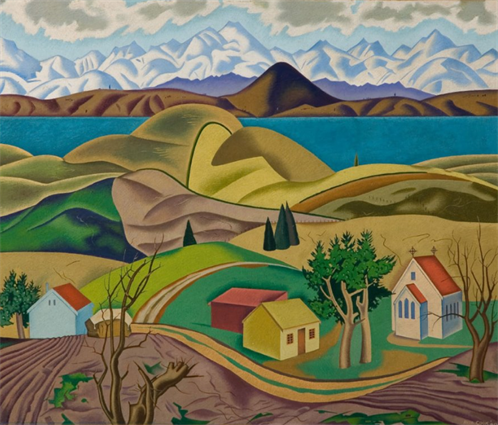 |
Angus, Rita, (1940). Central Otago. Oil on board. Size (hxw): 457 x 533 mm. Auckland Art Gallery Toi o Tāmaki, gift of Mrs Joyce Milligan in memory of Dr R R D Milligan, 1984. http://www.aucklandartgallery.com/the-collection/browse-artwork/6481/central-otago
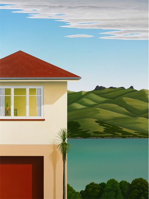 |
Allan, Hamish. Books On A Shelf. Acrylic on stretched canvas, 1220mm x 760mm. http://hamishallan.co.nz/archived.html.
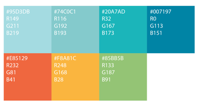
A range of blues represent the water cycle, the green represents vegetation, the slightly rusty red symbolises agricultural buildings (often a feature of landscape painters’ depictions of rural New Zealand), and an orange symbolises cultivated landscapes:
|
|
The LAWA colour palette
In terms of Kress & Leeuwen's spectrum, LAWA’s palette walks a deliberate middle line between the maxima of purity and hybridity. Saturation is not high enough that the colours are turned up ‘loud’ (reds ‘shouting’ “warning!” and blues being the water cliché), but there remains a degree of exuberance and expressiveness in keeping with LAWA’s intended tone of voice.
A design decision was made that, wherever possible to use the colours flat, that is, to avoid gradients, shading, shadows or tonal patterns. This is closely related to the debate about skeuomorphism and ‘flat design’ (see Visual style), and was an instinctual decision that avoiding ornamentation was more ‘honest’.
Kress & Leeuwen discuss how the affordances of colour are in the eye of the viewer, and are strongly value-laden. Just as flat colour “may be perceived as simple and bold in a positive sense”, it can equally be seen as “overly basic and simplified” (Kress & Leeuwen, 2002, p.358). Given that simplifying information is a key tenet of LAWA, the latter interpretation may be no bad thing.
Data visualisation
Our council partners were cautious about using traffic light colours within the data dashboards as they were concerned that some councils would object to the overt, green equals good, red equals bad “grammar of colour” (Kress & Leeuwen, 2002). I felt that leaving out this useful visual shorthand was making the data story more convoluted that it needed to be. Modulating the palette maintained the legibility of the message while avoiding the perceived negative connotations of ‘pure’ colours.
On graphs variables are limited so the data is always displayed in a single colour, gridlines are in a uniform grey, and decorative colour is avoided – “Dressing up a graph might serve a purpose in advertising, but it only distracts people from what’s important—the data—in an information display” (Few, 2008, p.13).
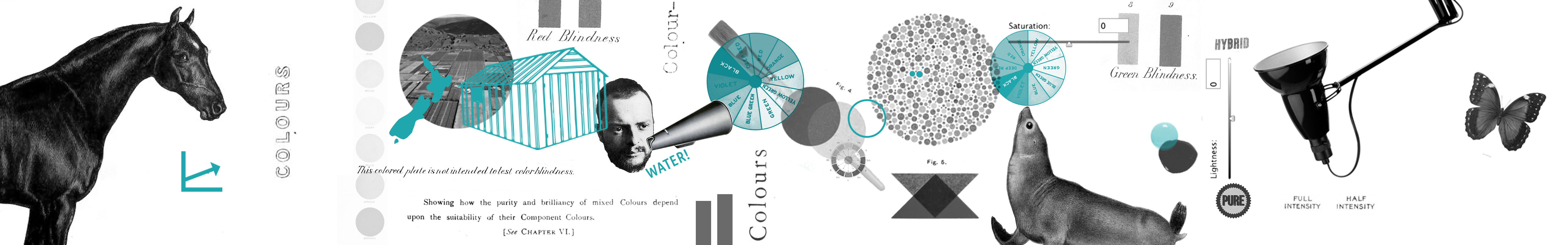
Accessibility and usability
Ensuring legibility through adequate contrast, and that colourblind users were not disadvantaged, were also key considerations, and are discussed in the Usability and accessibility section
Ethical Considerations
Colouring judgement
I discovered Alberts & van der Geest's research paper after the LAWA colours had been set. Their findings were that blues and greens were generally perceived as the ‘most trustworthy’ colours, and I considered claiming that research as rationale for LAWA, given blue-greens are a dominant theme. I won’t pretend never to have post-rationalised, but in this case, colour really was a trial and error decision sparked by a few inspirations.