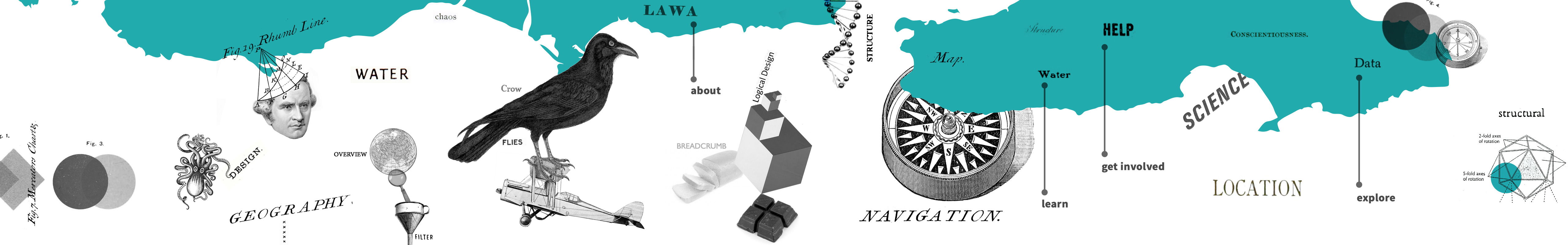
Site structure
Jo Bailey
January 2014
section Summary
- Websites with an intuitive structure, assisted by tools like breadcrumb trails, ensure that users are always able to orientate themselves and help the user reach the information they are looking for.
- Within LAWA and Making Good pages contain chunked text with headings to allow users to scan content quickly.
- LAWA utilises the principle of giving users an overview of information first, but giving clear pathways to access further and more detailed content.
…the only way to enhance the user’s ability to find his way around … is by providing better points of reference. In the same way that sailors navigate by reference to shorelines and stars, users navigate with reference to permanent objects placed in the programme’s user interface.
(Cooper, 1995, p.508)
Designing landmarks
For a website to be credible, it needs to be easy to use and useful (Fogg, 2002). A key component of ease of use is an intuitive structure that enables a user to find, without undue hindrance, what they are looking for.
Unlike books whose bound physical form suggests an order, “hypertextual navigation allows users to be transported right into the middle of a large unfamiliar web site” (Rosenfeld, 1998, p.44) via search engines or direct links. Well structured, consistent primary navigation and the use of breadcrumb trails means each page is contextualised, and a user can navigate up a level, or a number of levels, with ease. Ensuring URLs also reflect the site architecture (semantic URLs) helps orientate users and, if a link is shared, looks more professional, thereby enhancing credibility. Both LAWA and this site employ breadcrumbs and semantic URLs.
LAWA’s site architecture
Once there was agreement on the functions the site would perform, an initial site architecture plan was constructed. This was informed through affinity diagramming. The user workshops allowed us to conceptualise a range of user personas based on the participants, and to create user journey scenarios, which were tested with paper prototypes.
Sections
LAWA has four central roles:
- communicating science;
- providing recreational information;
- contextualising information (via stories, events and instigation of conversations);
- providing learning resources.
These form the primary navigation under Explore Data (science and recreation), Learn (learning resources), and Get Involved (news and stories). The need to identify who is behind LAWA (identified by the user groups, and specified in the WCP guidelines) is addressed by the fourth primary navigation label, About.
The primary navigation follows convention and appears at the top of the page across the whole site. Active navigation states are colour coded, and this colour is used for emphasis across the section to reinforce the navigational cues. A consistent footer containing a sitemap and a secondary footer with related content tailored to each page gives further navigational options. The secondary footer becomes a useful place for establishing contextual information, such as stories or learning resources within LAWA, but it also lets the user “locate with ease additional evidence relevant to the topic in question” (Fallis, 2004, quoted in Rieh & Danielson, 2007, p.38) which establishes the ‘third-party verification’ (Fogg, 2002) recommended in the WCP guidelines.
Mapping as navigation aid and symbol
The LAWA map is used as both a data visualisation tool and a navigational device. The map is a useful, instantly recognisable form and, as the information is spatial, utilising the map to move through the region/catchment/site structure is intuitive. “Maps are images of the world that proclaim their objective neutrality, an important source of their authority" (Wood, 2007, p.10), and as such, people tend to trust them.
The map is also a reinforcement that the site is about New Zealand. WCP guidelines suggest aligning with “respected organizations [sic]” (Fogg, 2002). New Zealanders feel a strong affinity with the shape of their country, so given that the domestic audience is the primary target group, the map may translate into a credibility-building feature, tapping into the shared national identity and fostering a sense that the user has a stake in LAWA.
Chunking and page structure
Content chunking is a ‘writing for the web’ technique where content is broken down into ‘chunks’, so that it is easy and efficient for users to consume. Headings give content a visual hierarchy. Users scan or skim information online (Nielsen, 1997), so using visual cues such as headings and bullets allows easier comprehension of the page content.
‘Overview, zoom and filter, then details on demand’
This principle was a maxim for LAWA. Coined by Ben Shneiderman, it is known as the Visual Information Sharing Mantra. Because LAWA contains a vast amount of detail, it is designed so that top level information is given first, and content boxes expand on demand, allowing a user to drill down as far as the raw data. The same principle is employed within copy, so that technical terms are highlighted and linked as glossary terms. The links are unobtrusive to users who do not require them to be explained, but it is never assumed that users already understand technical terms. From glossary popups, links to more detailed factsheets are provided when relevant.
Though hyperlinking to other content has been a feature of the internet since its inception, the use of short-form glossary popups is relatively new. Wikipedia uses a similar principle in-text to show the content of footnotes on the same page, and The Guardian has recently started using the convention:
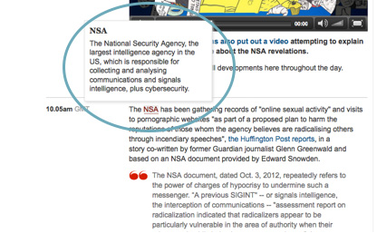 |
Screen capture from The Guardian, 27 November 2013. Note the use of a different link style to denote a glossary term compared to a regular link. This emerging convention is reflected in LAWA and Making Good.
Within this site, this is expanded to experiement with in-text icons to denote different kinds of links. In a recent New York Times multimedia story, icons within the copy were used to denote photographs or video, but only where that media existed on the same page:
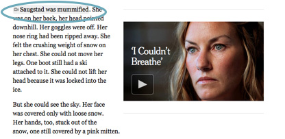 |
Screen capture from Snow Fall, a multimedia story released by the New York Times (Branch, 2012). Note the highlighted text and video icon, which link to the associated video on the right.
Making Good’s visual link style seeks to be transparent about what a user can expect when activating a link. Unless clicking on an external link icon, a user will not leave the site. This has the potential to increase user trust, and therefore enhance a website’s reputation and credibility.
Ethical Considerations
Lack of testing
We were unable to test our structure with any of our initial workshop participants, and so relied on experience, backed up by testing with internal resource (and feedback from the LAWA Steering Group). It would have been more robust to do proper proof-of-concept testing with users.
Use of the map
The map has been well received in subsequent testing as a navigational device, but it was dropped from the mobile version of the site purely to save money and development time. From a usability perspective, that means some users are disadvantaged solely by the device they are using to access the site. That falls short of best practice by some margin.
In-text icons: an untried convention
In Making Good my use of in-text icons to denote different types of links is largely untested. In fact, this is the test. I hope you as a reader do not feel experimented on!