Typography: the right type
Jo Bailey
January 2014
section Summary
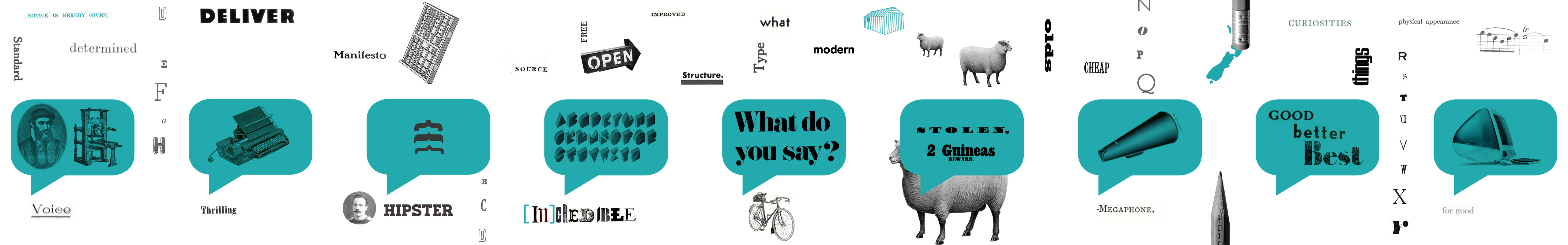
- Choosing a font is like choosing the voice you want to represent you.
- There needs to be harmony between what is being said and how it looks. If there is a disconnect, users will perceive the website as less believable.
- For LAWA a sans serif font – Source Sans Pro – was chosen, because it was open source, looked good, was not overtly ‘designerly’, and was versatile.
“Truth is not typeface dependent, but a typeface can subtly influence us to believe that a sentence is true … Indeed, we may be at the mercy of typefaces in ways that we are only dimly beginning to recognize.
(Morris, 2012b)
Typography, the final frontier
In 2012, journalist Errol Morris conducted an experiment. In a New York Times column ostensibly about asteroid collisions he posted a quote containing an assertion, and asked his readers if they agreed. But the question was a ruse. He was really seeking to test if there are certain typefaces “that compel a belief that the sentence they are written in is true” (Morris, 2012a). Viewers saw the quote in one of six randomly assigned fonts. Over 45,000 people responded, and the data was given to David Dunning, a Cornell psychology professor. Dunning’s analysis indicated that when the question was posed in Baskerville, there was a 1.5% advantage (in statistical terms, huge) in people trusting the statement.
Of course the test did not show why people trusted Baskerville the most and Comic Sans least, but Dunning puts it down to gravitas. Baskerville having “a tad more starchiness” than Georgia and Computer Modern (in second and third place), lending it more authority.
Inappropriate typography
Morris and Dunning also touched on the appropriateness of font choice. Comic Sans was perhaps deemed inappropriate due to context. If the question had been about cartoons, the response may have differed. Earlier research (Shaikh, 2007) suggests that trust, professionalism and believability are all reduced when content is presented in a font considered ‘inappropriate’. Even ‘neutral’ fonts (as determined in a previous study (Furman, 2009)) impacted these metrics.
Finding a voice
… typefaces can convey mood, attitude, and tone while having a distinct persona… Each document should be rendered in a font that connects the mood, purpose, intended audience, and context of the document.
(Shaikh, Chaparro, & Fox, 2006)
Choosing an appropriate typeface could be approximated to choosing a suitable ‘voice’ to marry the verbal language with the visual language. Childers & Jass (2002) describe typefaces as “communicating unique semantic associations to individuals distinct from the content of the written words they clothe”, and it is clear different fonts are perceived as having different personalities (Shaikh, Chaparro, & Fox, 2006). Given the explosion in typefaces available for web use now, the challenge is finding one that says what you want it to.
LAWA’s voice
Beyond normal usability concerns LAWA’s typeface needed to appear approachable, but credible; authoritative, but not authoritarian.
Having collected type specimens that I felt had these qualities, I ran an online survey for Open Lab, which was shared on social media. Mockup pages were created with different fonts, and viewers were asked which they deemed most credible. The one serif in the test (Adelle) was ranked highest, and the rounder sans serifs (such as Sofia) were consistently ranked lowest. Plenty of respondents tried to second-guess the choices – it appears designers (who were overrepresented in the sample) need to know they have chosen a font that other designers consider ‘good’ before they concur.
Designing for users, not just designers
Do designers ‘read’ fonts differently to non-designers? When CERN used Comic Sans in a presentation announcing the discovery of the Higgs Boson the decision was widely derided by the design community. This distaste is at variance with the general public’s perception of the font as happy, youthful, cuddly and casual (Shaikh et al., 2006). Perhaps it was actually a nuanced choice by the scientists, given their audience was the public. (I venture however that Comic Sans is never the right choice for a war memorial (Coles, 2012)). I wanted to avoid falling into the mode of designing for my peers rather than the users.
Modernist meaning?
For designers, the default ‘credible’, ‘neutral’ font would likely be a Modernist sans serif, such as Helvetica, with its “Platonic ideal and a generic sterility” (Heller, 2003a). However, as Heller points out, Helvetica “has long been used to obfuscate corrupt corporate messages: such is neutrality’s double-edged sword.”
Do non-designers see a grotesque or neo-grotesque (Helvetica being the most ubiquitous) and see ‘neutral’? Or is the connotation ‘corporate’? Or do they recognise it as a ‘designer’s’ font – it has after all been the subject of a mainstream film (Hustwit, 2007) – and is that wholly positive?
Koch (2012) states “There are virtually no rules to empirically interpret the meaning inherent in typeface designs – people intuitively decipher typefaces”, and perhaps this was designer’s overanalysis. I opted to sidestep Helvetica and family in favour of a neo-gothic face.
Made for web
Source Sans Pro was chosen, partly based on favourable survey feedback, and also because it was versatile enough to be used as heavy small caps in the logo, for headings and for body text. Furthermore, the fact that it is an open source font fitted the philosophy of the project, and it is designed specifically for the web rather than adapted from a print face, making it more legible on screen. Coincidentally, ‘Source’ was a concept name before LAWA was coined. Having a river connotation is no bad thing.
For Making Good I chose the sans serif font Ubuntu. Like Source Sans Pro it is distributed under an open licence and is a web font. It is well crafted (by type foundry Dalton Maag), and is different enough that it could never be mistaken for Helvetica. Though designed for a company – Ubuntu are an open-source software community – I admire their philosophy as an organisation so have no problem aligning myself with their name. They describe the font as conveying “a precise, reliable and free attitude.”
I also selected Libre Baskerville, a community-built font based on the American Type Founder's Baskerville from 1941, but tailored for web use with a taller x-height, wider counters and less contrast.
Ethical Considerations
‘Borrowing’ fonts
Stephen Heller calls it “akin to tapping into cable TV” (Heller, 2003b), but I cannot pretend we had licences for all the fonts we used in mockups. I ‘borrowed’ a couple, and ones we couldn’t lay our hands on we screen captured from an online type specimen. Technically this may be in contravention of most terms of use, but I see it as analogous to listening to music online. I’ll try it out, and if I like it I’ll buy the album.
Data picking
If I was going to rely on crowdsourced opinion, I would definitely have used Adelle, but I just didn’t quite like it enough. Is it unethical to pick and choose which data you use to inform decisions, and which you disregard? Clearly if you are running a medical trial it is, but in this case, I was not torn.
Cheapskate
To choose an open source font was philosophical, but it was also financial. Not having to use budget on buying a font was attractive. If we didn’t have a fixed budget, I may have felt differently.
Supporting local foundries
We did consider using a font from a New Zealand foundry on the basis that it would support local business, but it would have cost too much. Basing a decision on cost alone could be questionable – for example buying virgin forest paper over 100% post consumer waste – but in this instance the NZ product was not the best solution anyway.
Ethics approval?
I ran the font choice survey as part of my role as Senior Designer in Open Lab, not as part of my Masters project, so am citing it as secondary data. If I had conducted the same research (for effectively the same purpose) as an academic exercise I would have required a Low Risk Ethics Approval, so I have exploited a technicality. Results were anonymous, no personal data was collected, and the content was not contentious so I do not believe anyone was compromised, though in theory, circumventing the Ethics Approval process in this way could be very dubious practice.
What value culture?
Buying a NZ font also seemed somehow more culturally appropriate, and we knew that all the Māori glyphs would be present. Instead we used a font inspired by “twentieth-century American gothic typeface designs”. Still, on balance it was the better choice.