Visual style: looking good ≈ being good
Jo Bailey
January 2014
Section summary
- How a website looks affects the way it is perceived.
- A designer balances elements to achieve unity.
- There has been a trend towards a more minimal, ‘flat’ design style on the web recently, which may reflect a quest for a more authentic design style.
- LAWA avoids visual ornamentation, but photographs add a human element.
- Making Good employs personal imagery to disclose to the viewer how I work and think.
…social psychology research has shown that physically attractive sources (usually people) have been perceived to be credible sources … [this] also seems to hold true for evaluating the credibility of Web sites
(Fogg et al., 2002, p.58)
In good taste
Several studies suggest that aesthetically appealing websites are more trusted (Fogg et al. (2002), Fogg (2003), Robins & Holmes (2008), Alsudani & Casey (2009), Coker (2011)), but what makes a website attractive is less well defined.
Fogg et al. (2002) state that user credibility judgements are 75% based on overall aesthetics, but do not expand on how the users determine what makes an aesthetically superior website. Coker (2011) measured an increased overall trust of websites as “the internet has become prettier”, but a decrease in loyalty. Alsudani & Casey (2009) attempt to evaluate “aesthetic credibility factors” to enhance HCI. They assess “pure individual factors” (typography, design, pictures, etc) and visual composition as a whole, based on Gestalt psychology principles. They surmise “The more the home page of a web site achieves 'unity’ in its design, the more it is considered to be credible from the first look”.
From a designer’s perspective, the results of their tests are unsurprising. Typographic hierarchy, colour balance and careful placement of images are a designer's stock-in-trade, but they are not taught (and likely cannot be learnt) formulaically. Moreover, despite using a rigorous framework, what Alsudani & Casey deem to be more, or less, harmonious or balanced is by its nature subjective. As Jennifer Tidwell (2006) says, “good design can’t be reduced to a recipe”, but, a good designer can balance the right ingredients.
‘Authentic’ design
Accept perhaps that we are using binary and pixels on a machine… I myself have laboured over getting fake stickers and tea stains to look right in Photoshop before bringing them into my pages with CSS, but, in all honesty, who has ever managed to get a cup of tea to stick to a vertical computer screen? This is not a reality.
(Collison, 2010)
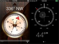
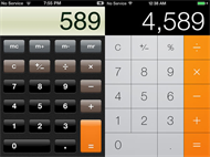
Just as in the 19th century changes in technology allowed ornamentation to flourish, post-web 2.0 design became increasingly stylistic and visually ornamented, enabled by tools like Adobe Flash. The epitome of this was the mimicking of real-world textures, such as the use of fake leather texture in Apple’s calendar app. The term skeuomorphism has been applied to this style.
Just as Modernism curbed this stylistic excess with its drive towards universality, abstraction and an ideology of form follows function, recent web trends have rejected ornamentation in favour of a cleaner, more functional aesthetic, manifesting as ‘flat’ design (Fadeyev, 2013).
 |
 |
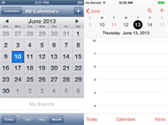 |
IOS6 vs IOS7 compass, calculator and calendar (Slade, 2013)
a new authenticity
Claims have been made for this recent shift being towards a new authenticity, rather than merely the latest design fad. Fadeyev (2013) describes it thus:
Authentic design aims to pierce through falsehood and do away with superfluousness. Authentic design is about using materials without masking them in fake textures… Authentic design is about representing function in its most optimal form, about having a conviction in elegance through efficiency.
(Fadeyev, 2013)
Authenticity and credibility are closely related, so philosophically, applying authentic design to LAWA has merit. Once again, appropriateness is the credibility driver. ‘Everything as simple as it can be, but not simpler’ (attributed to Einstein) was a maxim for the project as a whole – from communicating science, to data visualisation, to copy style – so reflecting this in the interface through visual simplicity was appropriate.
As well as avoiding ornamentation we were able to streamline the hierarchy by ensuring we had real data and content to use at the wireframing stage; the form of the page was informed by the function and contents.
Icon design
The LAWA icons were crafted to present a uniform look and feel, in a flat, unfussy style. Icons were used where they increased usability, not simply for aesthetic purposes. Where icons were metaphoric rather than literal (the abstract external link icon versus a picture of a swimmer denoting ‘suitable for swimming’) we used only well established conventions.
Use of images
Photography has a key role to play in LAWA, emphasising that the science is about real places, and the stories are about real people. Using stock imagery suggests that you have something to hide, and is considered less credible than “documentary” photography (Norton, 2012, p.17).
Because LAWA’s images come from a variety of sources, they vary in quality and style. The use of multiple sources actually increases credibility because it suggests that multiple people are engaged with the site, lending a degree of authenticity.
The logos of the main partners are all included in colour, to make them more recognisable but also to suggest a variety of voices. These logos allow LAWA to associate with the reputations of the partners. In the same way, Massey University’s logo is used on Making Good. However, where we display the 16 council logos on the About page, we have rendered them all in greyscale to help produce a feeling of unity, visually and metaphorically. These logos act as buttons to council profile pages, so we use the colour versions for rollover.
Advert free
Advertising on a website has the potential to damage credibility, especially when there is a blurring between sponsored content and the website’s own copy (Fogg, 2002).
Massey University is a partner in LAWA, with its original role being to consider, through the MBA programme, ways to commercialise the site or the data. This was concerning, as it risks damaging perceived credibility. Having to cater to adverts would have meant major compromises to the designs. Consider how much screen real estate has to be given over to advertising on MetService’s website:
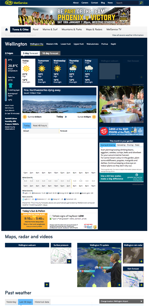 |
Screen capture from http://www.metservice.com/towns-cities/wellington/wellington-city. Note the advertising around the edges, but also within the dashboard.
Not only is the advertising visually obtrusive, but there are negative usability consequences, and some advert copy blurs the line between marketing and editorial.
The LAWA Steering Group agreed to veto advertising in phase one, and are actively considering other ways to monetise the site, such as licensing the model to overseas councils.
A note on Making Good
The visual style for this website employs the same techniques to optimise unity, but the images are highly personal, seeking to increase my credibility further by letting you see how I work and think; things I like and things I am inspired by.
The banners utilise collage to create a narrative through bringing ephemeral artefacts together, transforming and reimagining them to tell a story about the issues and how I relate to them. The active making process of collage reflects the title of the project. The balancing of elements is a metaphor for my mental processes attempting to balance and reconcile my thoughts about good design.
Collage has a long history as a medium for dissent. This reflects my anxiety about design as an agent for increasing consumption.
Next: Colour: setting the tone
Ethical Considerations
That’s bullshit!
This point really runs across the whole project, but relates to presenting the designs to the clients, so I will place it here. There is such a huge dose of trial and error in producing websites that, when it came to justifying our decisions, I felt presenting it as evidence-based was a stretch. Michael Bierut (2005) says “…every design presentation is inevitably, at least in part, an exercise in bullshit. The design process always combines the pursuit of functional goals with countless intuitive, even irrational decisions ... designers are direct about the functional parts of their solutions and obfuscate like mad about the intuitive parts, having learned early on that telling the simple truth — "I don't know, I just like it that way" — simply won't do” (read more). Though I don’t think we went over the top, I definitely got to the edge of my comfort zone.
Pick and mix
There are images in the Making Good banners plucked straight from Google image search, though most came from items I scanned myself, or from Vintage Printable, an archive of public domain images. Sometimes though, if you know what you are looking for, search, right click and copy is the default. I have tried to stick to non-copyrighted material, and as I have significantly transformed the images, I would (if I was in the US) claim this is “fair use”.