Usability and accessibility
Jo Bailey
January 2014
Section summary
- Usability describes “how effectively, efficiently and satisfactorily a user can interact with a user interface” (Assistant Secretary for Public Affairs, 2013)
- Accessibility describes “the set of properties that allows a product, service, or facility to be used by people with a wide range of capabilities” (W3C Web Accessibility Initiative, 2003) – disability and device type may both present accessibility challenges.
- Within LAWA, text legibility, considerations for colourblindness, and use of responsive web technologies were all considerations.
Usability describes “how effectively, efficiently and satisfactorily a user can interact with a user interface” (Assistant Secretary for Public Affairs, 2013).
Accessibility describes “the set of properties that allows a product, service, or facility to be used by people with a wide range of capabilities, either directly or in conjunction with assistive technologies” (W3C Web Accessibility Initiative, 2003). This may relate to people with a disability, but also covers ensuring that different devices can access an appropriate version of a site.
Usability
Key considerations within LAWA that relate to usability include the consistent application of structural and navigational elements, colour coding in navigation, and easy access to the search function. Within pages, chunking and expanding content provide unimpeded access.
Care has been taken to ensure that there is adequate contrast between colours, especially when text is coloured, or used over coloured blocks. Earlier iterations of the design used various shades of the core palette for text over colour, but ultimately we opted to use white text. The shades, as well as being slightly harder to read, just seemed overly fussy. For large areas of text, dark text on white background is always used. This is considered more legible than light text on a darker background (Hill and Schraff, 1997) in (Lee & Rao, 2010).
Text legibility
The LAWA font – Source Sans Pro – is designed for screen use. It is highly legible, and the default size was chosen to be comfortable for the majority of users (who can change the text size via their browser if they wish). For body text, sentence case is always used, as it is most comfortable for the eye (Kurniawan & Zaphiris, 2005). Care has been taken to ensure that line length is limited to the maximum considered comfortable (Ling & van Schaik, 2006).
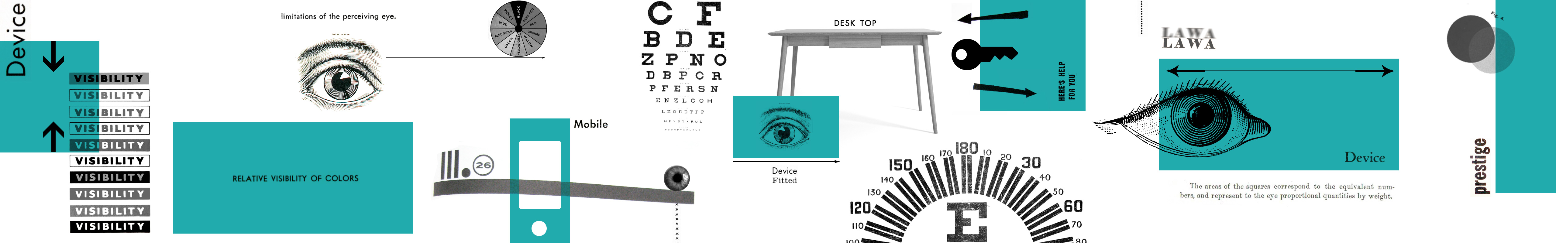
Colour: an accessibility issue
With approximately 1 in 10 men and 1 in 100 women suffering from colourblindness (Stone, 2006), ensuring that users with deficiencies in colour perception are not disadvantaged is a major accessibility concern on the web. Whenever icons have been colour-coded on LAWA, they never rely solely on colour for meaning; the icons also have pictorial representations, or explanatory text, or, where necessary, both. At present there are no graphs or other visualisations on LAWA where colours denote different values. In future phases, if this becomes necessary, avoiding the use of red and green (the inability to distinguish between red and green is the most common type of colourblindness) in the same display will be paramount.
Device neutral: responsive web design
Responsive web design uses flexible grids, images and media queries to determine how content behaves based on screen size and orientation (or browser window size), with image size and resolution changing automatically based on device and user preference. In theory, responsive design removes the need for a separate mobile version of a website, and means all users get an experience optimised for their device.
Within LAWA, responsive design was our goal. However, the complexities of having a layout with a map did not translate well to mobile screens. Because there are multiple possible navigation pathways, we took the expedient and pragmatic decision to remove the map when viewing on smaller devices. Clearly, this excludes many users from having a complete experience of the LAWA site, and was perhaps a compromise too far. An ideal solution would be the development of a LAWA app to complement the website.
HTML5
HTML is the core language of the internet, and HTML5 is its most recent incarnation.
The reason that LAWNZ needed to be replaced was because it was Flash based. Adobe Flash is a proprietary software platform used mostly for animated and video content. Most mobile devices do not support Flash, so many users were excluded from experiencing LAWNZ.
HTML5 allows browsers to perform essentially the same functions as Flash, but using a non-proprietary technology that can be implemented across multiple platforms. Philosophically, LAWA is about democratising access to information. Therefore using what is essentially an ‘open format’ technology is important.
Ethical Considerations
Open access
We have not actually tested LAWA with screen reading devices used by visually impaired people. It would have been most ethical not only to retrospectively test the developed site with visually impaired users, but also to have included, at the workshop stage, people with disabilities which could affect their interaction with LAWA.
Mobile disadvantage
I have mentioned the removal of the map from the mobile display in the site structure section, but it warrants another mention. We wanted responsiveness to be a core tenet of LAWA, but in reality it has been compromised for expediency. If analytics show a high proportion of mobile device users, we will be able to justify a mobile app to give them the best possible experience in a subsequent phase.