Science communication
Jo Bailey
January 2014
Section summary
- Graphs and maps convey a sense of trustworthiness.
- Data visualisation can reveal the meaning in complex data.
- It is easy to cherry pick data to tell a politicised story on a graph.
- In LAWA, the scientist had already determined what the data showed, so a dashboard display was the logical way to frame the information.
- But access to raw data and the ability to plot this on graphs in LAWA demonstrates transparency.
- Scientific language, even when used correctly may be confusing because what a term means may have a layperson interpretation (e.g. statistical significance vs. something significant to me)
- Where possible, LAWA presents live data, as much to demonstrate the site is updated as to offer a useful tool.
Making a presentation is a moral act as well as an intellectual activity. The use of corrupt manipulations and blatant rhetorical ploys in a report or presentation … suggests that the presenter lacks both credibility or evidence
(Tufte, 2006, p.141)
Truth be told
Data visualisations like graphs and maps are commonly taken at face value, with “automatic attachment of credibility” (Burn-Murdoch, 2013). Burn-Murdoch believes that this is because in education, “… data visualisations are overwhelmingly used simply as a medium of displaying final results.” (Burn-Murdoch, 2013), whereas text is a medium to critique.
Visualisations are capable of making complex datasets reveal their meaning. John Snow’s cholera map (Rogers, 2013) is perhaps the most famous example, and this excellent interactive New York Times census data visualisation is another case in point:
|
|
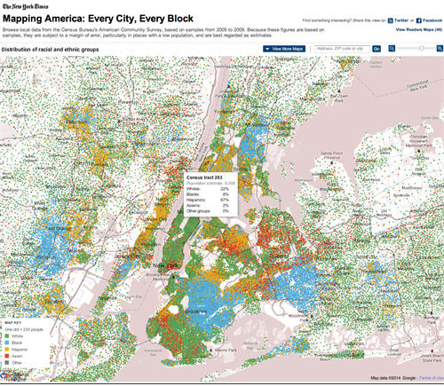
Screenshot of Mapping America: Every City, Every Block.(Bloch, McLean, & Carter, 2012). Census data on ethnic groups is mapped onto an interactive display, showing starkly how some areas are almost entirely mono-ethnic. http://projects.nytimes.com/census/2010/explorer
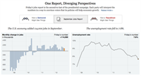
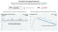
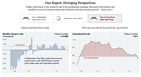
Graphs, like statistics, can be cherry-picked or manipulated to make a dishonest point. But even if they are not deliberately misleading, a graph can still be technically correct, but tell a politicised story. Take for instance this New York Times interactive graphic that lets you select a Republican or Democrat view of a dataset:
 |
 |
 |
Screen captures from http://projects.nytimes.com/census/2010/explorer. L to R: ‘neutral’ view; Democrat view; Republican view. (Bostock, Carter, Cox, & Quealy, 2012)
By drawing attention to specific features of the graphs a different version of the ‘truth’ can be told. Within LAWA, neutrality (rather than a particular rhetorical position) was the aim. where users are able to view raw data on graphs, best practice guidelines (in terms of colour, typography, labelling of axes, etcetera.) were adhered to, and Google charts plots the graph based solely on the input data selected by the user.
Data in LAWA
The first consideration for visualisation is always the data. Stephen Few says “show me the numbers” (Few, 2012), but for LAWA the water quality data had already been processed into chunks to depict categories; the meaningfulness of the data had been assigned for us and the users.
This makes sense for most people – not everyone can interpret samples and know if a trend is statistically significant or not – so a simple dashboard works well. We also ensured that the methodology is explained via glossary explanations and factsheets, thereby giving context.
To increase transparency, we pushed to allow access to the raw data for those users who want it. Data can be plotted onto graphs in LAWA over user-determined timescales, or downloaded as a .csv file.
The scientists were initially reluctant to allow this, as they felt the data could be misinterpreted. This may be the case – we have added caveats to help the user (and indemnify the scientists) – but to withhold information altogether on the basis that a user may form an independent interpretation would be prescriptive and didactic. Democratising access to this data is necessary if LAWA is to become the ‘freshwater hub’ that the stakeholders envisaged.
Depicting state and trend
Each site has a display for water quality trend and water quality state. Trend is shown as one of five categories, from significant degradation to significant improvement, and state as a quartile value. In considering how to show these, the power of the 'stupid question' came into its own.
When we looked at LAWNZ, we found that nobody from Open Lab could adequately explain what the quartiles meant. Marked as Q1 to Q4, the immediate perception was that this had something to do with quarters of the year:
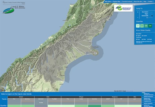
The LAWNZ dashboard. Quartiles are not explained on either the dashboard or via popup explanations.
LAWNZ trend and state (quartiles) were shown along the bottom of the page, and anecdotal testing suggested that people tried to read the display from left to right, as some kind of change-over-time rather than a series of discrete metrics.
After experimentation, a stylised distribution curve icon was chosen as the most comprehensible way to graphically represent the quartiles. This was supplemented with explanatory text, and colour coded from best (green) to worst (red), and further explained by way of glossary explanations. The map acts as a secondary visualisation tool, displaying the comparative state quartiles of other sites, catchments or regions.
The same format was used for the trend icons – stylised graphs with colour coding, textual descriptions, and popup glossary explanations:
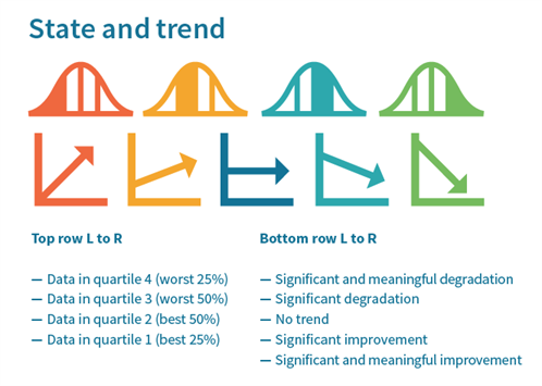 |
LAWA state and trend icons.
The problem of language
An unresolved issue is the gap between a layperson’s interpretation of statistical terms, and their actual meaning. Significant means statistical analysis can detect a pattern, but that it may be inconsequential; meaningful means that a conclusion can be drawn from it. Yet to most people, significant would lead them to believe that something noteworthy had happened, and that they may even be able to see that reflected on the ground. In using technically correct terminology, are we in fact offering a confusing interpretation?
What is useful to users?
The user groups told us that they really wanted to know where they could swim, and if ‘their’ place had water quality issues. The Ministry for the Environment releases an annual Suitability for Recreation Grade result for a selection of sites, and we wanted to be able to display this on LAWA. Despite reservations from some councils (a lot of sites are rated poor) we did include it. However, terminology is again an issue. A poor site may not be poor all the time. Further, it is a grade based on sampling over a long period, not an indication of conditions at the site at the current moment.
The drilldown principle
Within the copy and site structure we have adhered to the ‘Visual information sharing mantra’: overview, zoom and filter, then details on demand (Shneiderman, 1996). Scientific indicator dashboards list all the indicators (clarity, bacteria, etc.) with icons to indicate the state and trend (overview). Clicking on these dashboard panels opens further information about the variables and gives access to graphs (zoom in, filter). Another click and the graph can be adjusted by timescale, or raw data downloaded (details on demand).
In terms of credibility, this multi-level process fulfils several functions. It is transparent (giving access to raw data); it makes the site easy to use (content is managed so that a user does not have to digest it all at once); and useful (all variables are explained and placed in context).
Live data
Another element users wanted was real time information. Only a few sites have live monitoring equipment (for dissolved oxygen, water temperature and flow), but even though these will be of limited use to most people, it does set a precdent of aiming to keep information fresh (one of the core WCP guidelines).
Live data is presented as a dashboard of the most recent samples, and as with the indicators, selecting them opens the sample history.
The Cawthron Tick
The 'Cawthron tick' identifies data or methodology that has been assessed against best practice and verified by the Cawthron Institute. This verification process utilises the WCP principle of “third-party support”.
Ethical Considerations
Cherry picking
At no point whilst considering how to display the variables given did I think to question if what we were being asked to show was right. Subsequent conversations with Dr Mike Joy have made me reappraise that. Regional councils are not bound by law to collect samples in a standardised format. They can – if they choose – collect all their samples upstream of where pollution enters the river system. I do not doubt the credibility of the scientists involved in LAWA, but what if a policy decision taken for political reasons means a sampling regime is deliberately chosen to obscure the picture? I hope we can get some robust debate about this though LAWA. I want to know for instance why all councils are not obliged to sample at the coast, when all possible pollutants have entered the river. Fundamentally, I am not equipped to make these judgements, so how can I expect the public to be? Should I have asked more questions?